Trace
Integrating a standalone app into the existing TD Mobile Banking App
⚠️ Disclaimer: Due to intellectual property restrictions on this project, I am unable to publicly discuss all details, or include more pictures. For more details, you can reach out to me :)
UX Design
Research
Prototyping
6 min read
TIMELINE
January - March 2024
DESIGN ROLE
UI Design, Research
Trace Before
Trace Before the Integration
Trace After
Trace After the Integration
Overview
Trace is an app that promotes sustainable shopping practices while highlighting small businesses.
Trace is an app that is designed to promote sustainable shopping practices while highlighting small businesses, specifically B-corp businesses. Previously a standalone app, our team was tasked with integrating the core features of the app into TD's mobile banking app in the U.S. Through a unique rewards program, users earn points for their purchases, which can either be redeemed for cash back or donated to sustainable causes, aligning with Trace's mission to encourage conscious consumerism and community support.
The goal is to help expand TD’s presence in the US and advance TD’s ESG goals.
As part of TD's commitment to expanding its presence in the US and advancing ESG goals, Trace represents a strategic initiative to revolutionize the way consumers interact with local businesses and contribute to positive environmental impact on their local economies.
We were tasked with moving from a standalone app, to integrating Trace into TD’s mobile app in the US.
Initially, Trace was conceived as a standalone app, complementing TD's existing financial products, however, it was later integrated into TD’s mobile banking app. This app was launched into the US market, since Trace is an open banking platform. Trace's launch in the US market signifies a significant step towards achieving TD's vision for sustainable banking solutions and fostering a culture of responsible consumption.
Problem and Users
Shifting Toward a 'Local-First' Focus: Empowering Sustainable Shopping and Small Businesses in the TD Ecosystem
Initially conceived as a sustainability-focused project, the purpose of this initiative was to tackle the challenge of promoting sustainability and supporting small businesses within the TD ecosystem. However, after conducting comprehensive user interviews, we recognized the need to pivot towards a local-first approach, aiming to inclusively address all user demographics. It was also found that TD’s US presence was not strong enough, which led to creating this product which falls outside of traditional banking. The primary goal remained consistent: to develop an app that incentivizes users to engage in sustainable shopping practices while highlighting the significance of local businesses and B-Corps.
Who Are The Users for Trace?
TD Customers interested in sustainable living
The primary users of this product were individuals who were TD customers with an interest in sustainable living practices and a desire to support local businesses. Additionally, the target audience extended to individuals who were not yet TD customers but shared similar values and could potentially be converted to TD customers through the offerings of the product.
Internal Stakeholders to obtain buy-in from
The audience also included a Line of Business (LOB) within TD, which was a crucial stakeholder group that the project team aimed to gain buy-in from. This group played a significant role in decision-making processes, providing input and feedback to ensure the product aligned with TD's strategic objectives and met the needs of both customers and the organization.
Local-Oriented Individuals who value community connection
In addition to TD customers and potential customers, the product targeted local-oriented individuals who valued community connections and sustainable practices. These individuals were likely to engage with the product's offerings, driven by their interest in supporting local businesses and making environmentally conscious decisions.
My Role and Responsibilities
As a UI/UX designer within the project team, my responsibilities were multifaceted to the successful integration of the existing standalone app from the innovation team into the TD mobile app ecosystem. Working closely with a team of approximately five individuals, consisting of designers, product managers, and developers, I undertook the following key tasks:
Gathering Visual Assets to maintain brand consistency
I was tasked with collecting and organizing visual assets from the standalone app. This included icons, graphics, and other visual elements essential for maintaining brand consistency and user familiarity within the TD mobile app environment.
UX Information Architecture to Define the MVP
A critical aspect of my role was to establish the information architecture for the integrated app. This encompassed defining the Minimum Viable Product (MVP) features as well as conceptualizing the future-state flow, considering both open and non-open banking scenarios. I collaborated closely with the product managers and developers to ensure the architecture catered to user needs and technical feasibility.
Visual Design and Prototyping of the Integrated App
Leveraging my skills in UI/UX design, I was responsible for crafting the visual design of the integrated app. This involved creating wireframes, mockups, and prototypes to visualize the user interface and user experience enhancements. Iterative prototyping allowed us to refine designs based on user feedback and stakeholder input, ensuring a user-centric approach throughout the process.
Scope and Constraints
In navigating the scope and constraints of the project, several factors presented both challenges and opportunities that influenced our approach and outcomes:
Tight Design Timeline
One of the primary constraints I encountered was the tight timeline of just a month for the integration of the app. This necessitated a streamlined and efficient process, prioritizing essential tasks and features to ensure timely delivery without compromising on quality. Despite these limitations, I remained committed to delivering a solution that met the project objectives within the allocated resources.
Seamless User Experience Across Platforms
Ensuring a seamless user experience across platforms was another critical aspect of the project scope. Given the constraints of the existing architecture, we faced limitations in optimizing user pathways and interactions within the integrated app. However, we approached this challenge by conducting thorough user research and leveraging UX best practices to design intuitive navigation paths and interfaces that minimized friction for users transitioning between different platforms.
Scope Stability
Despite the constraints, maintaining stability within the project’s scope was essential to prevent scope creep and ensure alignment with the project objectives. Any changes to the scope had to be carefully evaluated against the project timeline to mitigate potential risks to project success.
Design
Since the goal of this project was to integrate the standalone app into TD’s existing banking app, there were many changes that needed to be made. Both the standalone app and the TD mobile banking app had their own design systems, with completely different branding, fonts, and component styles.
Gathering Assets to Easily Maintain Brand Consistency
● I scoped and collected visual assets from the standalone app, ensuring seamless integration into the TD mobile app while maintaining brand consistency and visual coherence.
● I also organized and cataloged assets which matched the existing TD mobile banking app to streamline the design process
User Flow Creation for Open-Banking and No-Open Banking Scenarios
● I developed two distinct user flows for both the MVP and future state version to accommodate different user scenarios and interactions within the integrated app. The MVP version did not have the open banking flow, due to technical and financial constraints. The future state version included the open banking flow, which was rigorously tested and liked by users, but will require more technical deep dives and time.
UI Design
● After creating the assets, I used them to design high fidelity screens of the app post-integration. The mapping of user flows and the component audit expedited this process, and helped ensure brand consistency.
The Design Process
Trace Before
Original pre-integration screens from the TD Mobile Banking app
These are the original main menu and accounts screens, where I did an exploration on where the entry point for Trace could be.
The main issue here is that due to TD mobile banking app user’s habits, we had to make sure the entry point did not interfere with the user's routines.
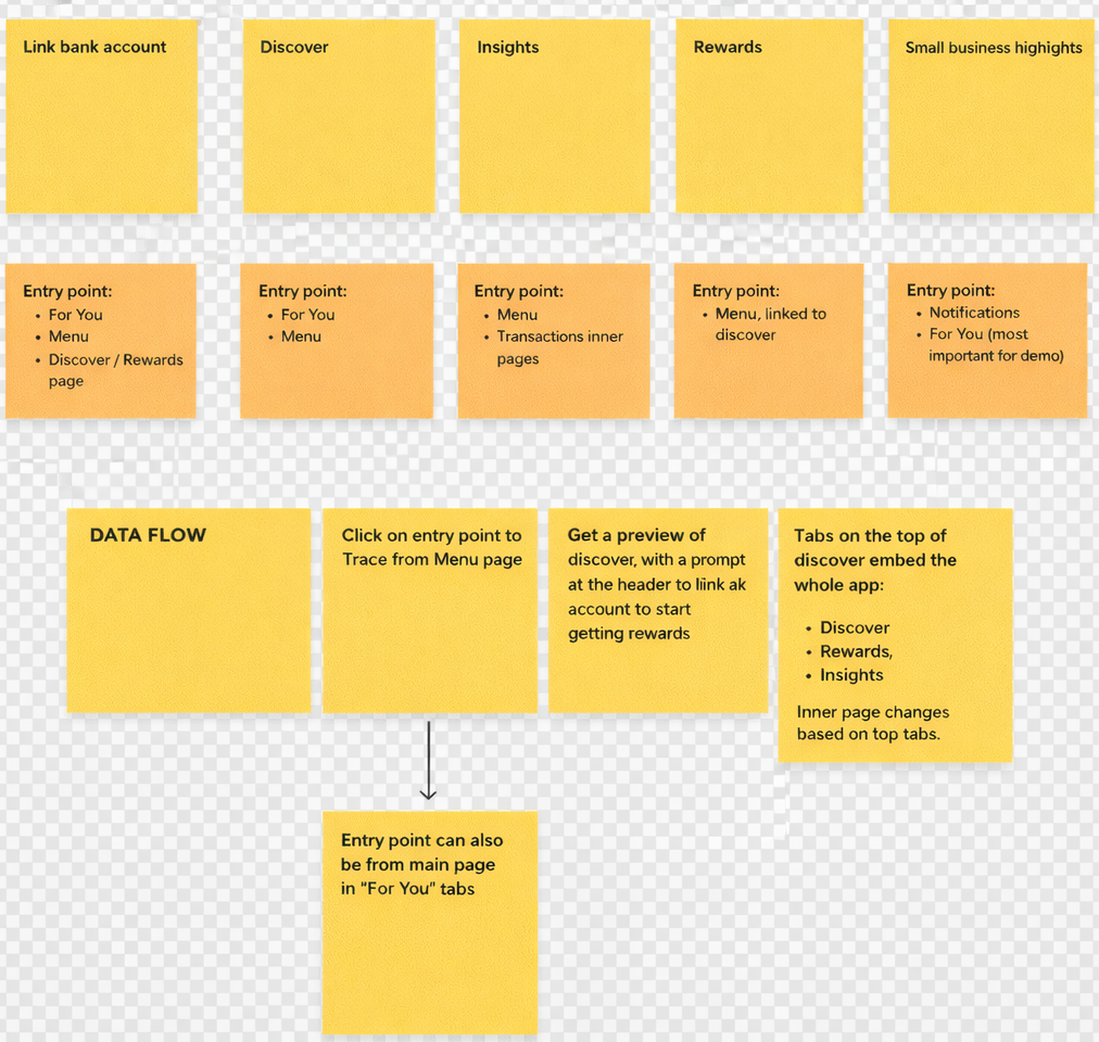
Finding prospective entry points for Trace
For the different features of Trace, where can the entry point(s) be on the current mobile banking app? Main themes of either the menu or For You page in the accounts page came up. These made the most sense as they are both easily accessible from the bottom navigation.
Trace Before
Exploration within the 2 refined sections on where the entry point could be
Trace Before
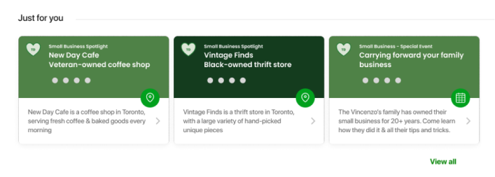
These cards include the title of the small business, the type of social cause they support and a basic description. All these cards are clickable, and leads to a details page about the small business, including all the information from the card, plus more about the business and directions on getting there.
Accounts Page
The just for you section of the accounts page made sense for an entry point, as the accounts tabs would be the first page that would open by default when a user opens the app, and lets users see important information quickly. This tab gives an overview of the customer’s accounts and gives them the option to complete common tasks. Under the “Just for you” heading, this section focuses on black owned, LGBTQ+, and family owned businesses - and on businesses that have TD Small Business accounts. It is placed here, as users can see new places in their community, and get prompted to see new places in their community, all while learning about different causes they can support.
Menu Page
The menu page made sense for the primary entry point for the Trace app, as the menu is frequently used for tasks that require more time and energy than the accounts tab. The primary entry point here is a carousel of the different functions of Trace, including DIscover, Rewards, Link Bank Account and Insights.
Trace Before
Trace Before
Placed under the Shop local & Get Rewarded heading, the order of the Trace entry CTAs reflects what would be most and least popular.
Since the main goal of Trace is customers spending on local businesses, the Shop Local Businesses card is shown first, where they can earn points through purchases.
The second is the Get Cashback card, as this is the second main function of Trace. Users can click on this card to redeem their points for cashback.
The third is to see shopping insights, which is where users can see how much money they’ve spent and how many points they’ve earned.
The last tile is to link your bank account to the app. This is left for last, as most customers would have already linked their account on sign-up, and for those who haven’t, they’d get the chance to explore all the features Trace has to offer before linking their bank account for good.
Rewards and Insights Page
As part of a side task, I was in charge of redesigning parts of the Insights and Rewards Page.
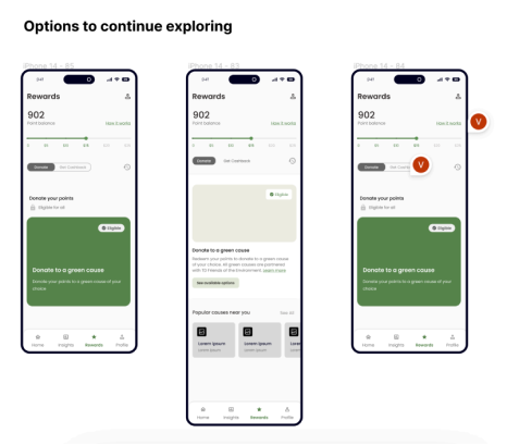
For the Rewards page, these were the initial ideas to continue exploring.
Trace Before
Trace Before
Trace Before
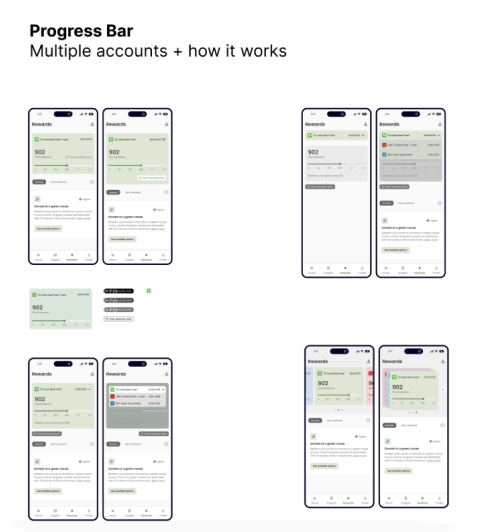
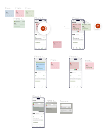
On our rewards page, I did an exploration for this credit card style card to display the user’s points. Here, the cards represent the different credit cards a user links to this app to earn rewards upon. I went through multiple different ways to lay out this card, such as tabs, accordions, and carousels. The idea was to make it super easy for you to switch between the three cards without getting confused. I wanted to find the setup that feels the most natural for navigating through your linked credit cards.
Ultimately, I decided to have a carousel view for the cards, for multiple reasons.
Carousels optimize space. Especially when you have 3+ cards to show, carousels allow for chunks of information to be displayed in a concise form, allowing other crucial information to also be shown on the page
Focus on individual items. Carousels help users focus on one card at a time, which is useful to not confuse one card with the other.
Carousels are scalable. In the event a user wants to link even 5 cards, carousels provide the space to do so.
Outcomes
The user flow creation process facilitated a clear understanding of user interactions and navigation paths within the app, enabling stakeholders to visualize and evaluate the user experience from end to end.
User flow diagrams served as valuable communication tools, fostering alignment among team members and stakeholders regarding the app's functionality and usability requirements.
Key findings from user flow analysis informed iterative design decisions, guiding subsequent iterations of wireframes and prototypes to better align with user needs and project objectives
These newly integrated designs will be demo-ed to the Small Business team at TD, to hopefully get approval to move forward and integrate this in the app
Personally, this project provided invaluable learning experiences in UX design, stakeholder engagement, and user-centered design principles. It reinforced the importance of adaptability, resilience, and continuous learning in navigating complex and dynamic project environments. I was able to gain and develop skills in visual design, while learning to synthesize feedback and iterate on designs to meet evolving user needs and preferences.
Next Steps
User Testing
● Conduct comprehensive user testing sessions with a diverse group of participants to gather feedback on the integrated app's usability, functionality, and overall user experience.
● Identify areas for improvement and iteratively refine the app based on user insights and feedback to enhance usability and address any usability issues.
Confirming Development Feasibility
● Collaborate closely with developers to validate the technical feasibility of implementing the proposed design enhancements and features within the TD mobile banking app environment.
● Conduct technical assessments and feasibility studies to ensure smooth integration and compatibility with existing systems and infrastructure.
Internal Launch with MVP built
● Plan and execute an internal launch of the integrated app with the MVP features to a select group of TD employees or beta testers.
● Gather feedback from internal stakeholders and early adopters to validate the effectiveness of the integrated app and identify any areas for further refinement or enhancement.
● Use insights from the internal launch to inform the development roadmap and prioritize future iterations and feature enhancements for the app.
A special thanks to Meghna Bellani for mentoring and guiding me through this project, and as a designer <3