Redesigning WealthyPlanet's Website
Role
Product Designer Intern
Timeline
4 months
Tasks
User research, Interaction + Visual design, Design Systems, Product thinking
Tools
Figma, FigJam
Redesigning WealthyPlanet's Website
Role
Product Designer Intern
Timeline
4 months
Tasks
User research, Interaction + Visual design, Design Systems, Product thinking
Tools
Figma, FigJam
TLDR
Designed the primary acquisition and onboarding experience for an AI fintech during a critical pivot. Focused on trust, clarity, and guided activation and stronger early user engagement.
+ 62%
Increased user sign-ups in the first month post-launch.
+ 20%
Users time spent time on the website.
Overview
Context
I joined WealthyPlanet as the sole designer during a critical pivot to an AI-powered financial planning product. I partnered directly with developers and leadership to define the website experience, create an onboarding flow, and improve user trust and conversion.
I arrived to a backlog of design work to be done, with existing files being poorly documented and a non-existent design system. I led the end-to-end redesign of the website, creating a user-friendly, intuitive platform. After the redesign, users reported higher confidence in navigating their financial planning journey, leading to increased sign-ups and greater trust in WealthyPlanet's services.
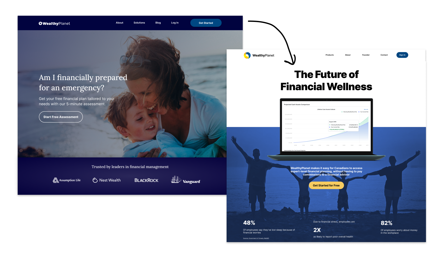
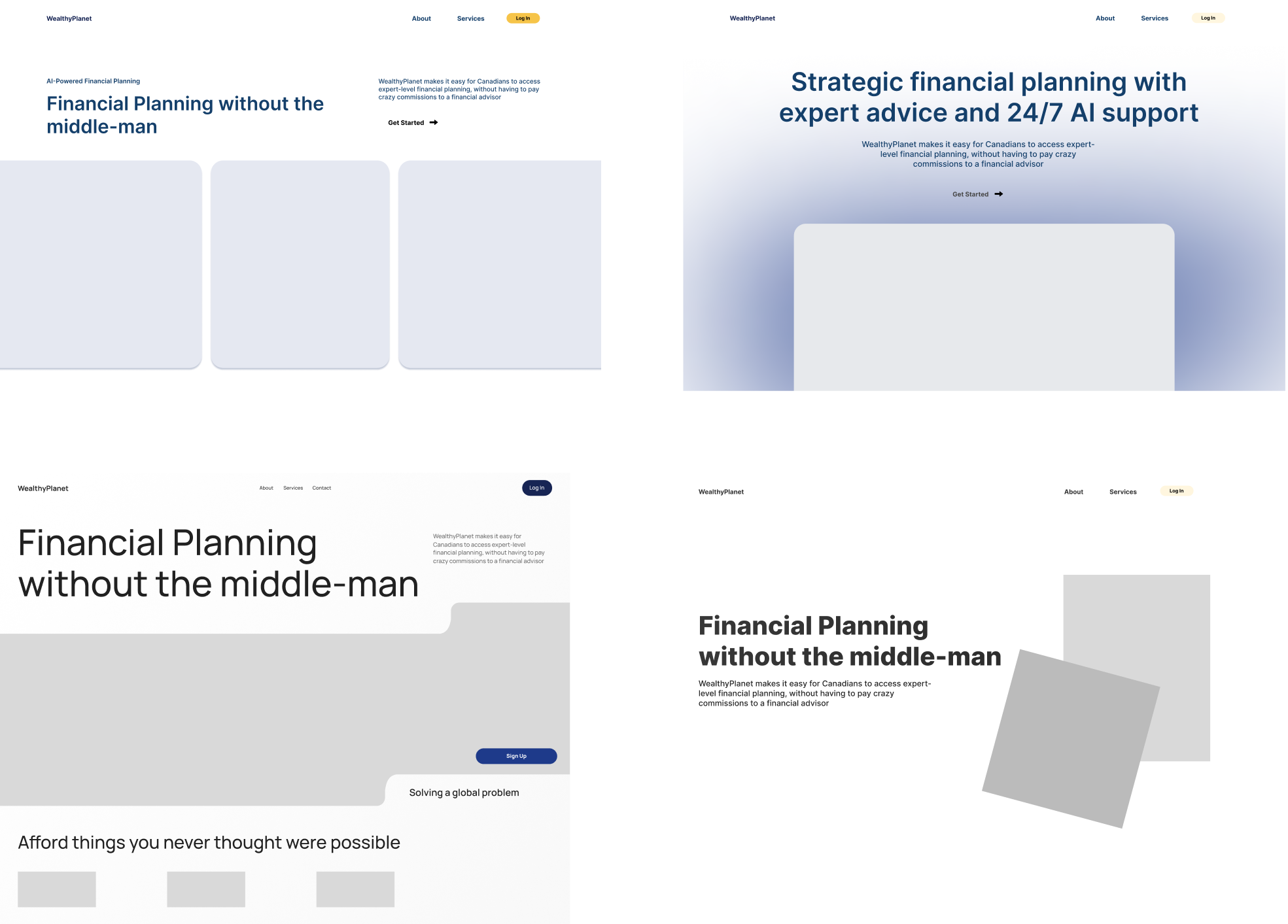
A before and after of the WealthyPlanet website redesign
Understanding the Space
WealthyPlanet had a trustability problem. The existing website lacked clarity, engaging content, and essential functionality.
Clarity
Users couldn’t quickly explain what the product does which translated to users were not converting; first impressions didn’t build confidence.
Engagement & Guidance Weakness
No structured pathway for users to take meaningful action, from landing → sign-up → onboarding. Users dropped off immediately after signing up; the platform wasn’t guiding them toward activation.
Trust Deficit
Early-stage fintechs are judged heavily by interface stability and transparency. Broken links, inconsistent UI, and missing social proof made the site feel untrustworthy.
Competitive Analysis
Thorough competitive analysis was provided to me by WealthyPlanet, using which I further compiled my own research to understand how fintechs build credibility and simplify complex financial products.
Insight
Design Implication
Competitors often lead with trust signals (stats, testimonials, data points) before features.
Make the core value and product purpose immediately understandable.
Visual and textual consistency across web and mobile is key for credibility and ease of use.
Consistent UI, brand alignment, and subtle proof points to reduce anxiety.
Progressive onboarding flows are critical to guide new users through first actions.
Design the first user journey from landing → sign-up → onboarding with minimal friction.
HMW Statement
How might we design a website that simplifies financial planning and builds trust with middle-aged parents seeking financial security for their family’s future?
Defining the Solution
Site Audit
To understand the problem to a deeper level, I conducted a site audit of the old website to highlight areas that needed to be fixed.
🚩 The landing page failed to explain the product clearly
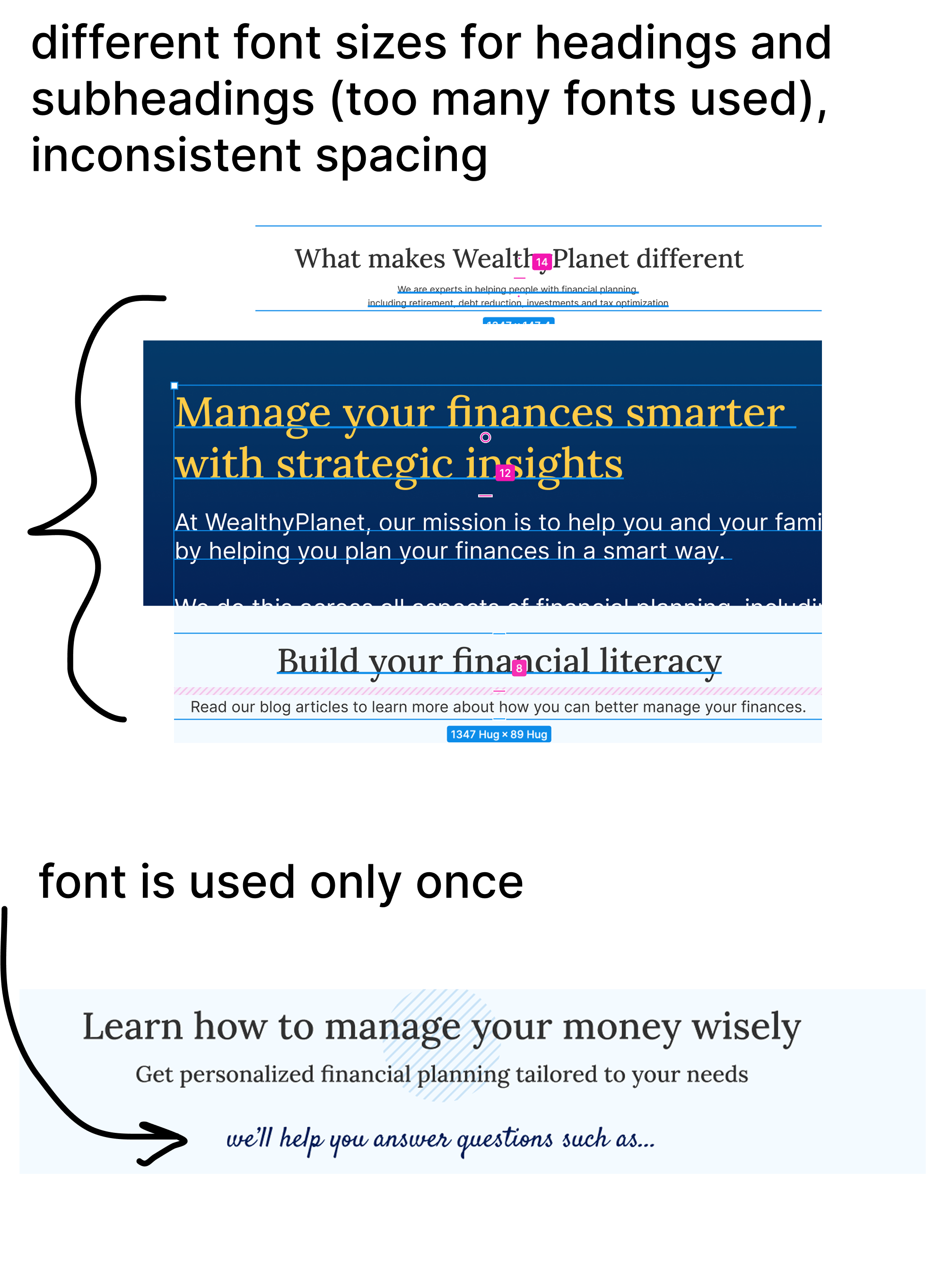
🚩 Inconsistent spacing, typography, and color usage created visual noise
🚩 The mobile experience was partially broken
In a trust-sensitive space like fintech, these issues compounded quickly, users interpreted instability as risk.
Mapping the User Journey
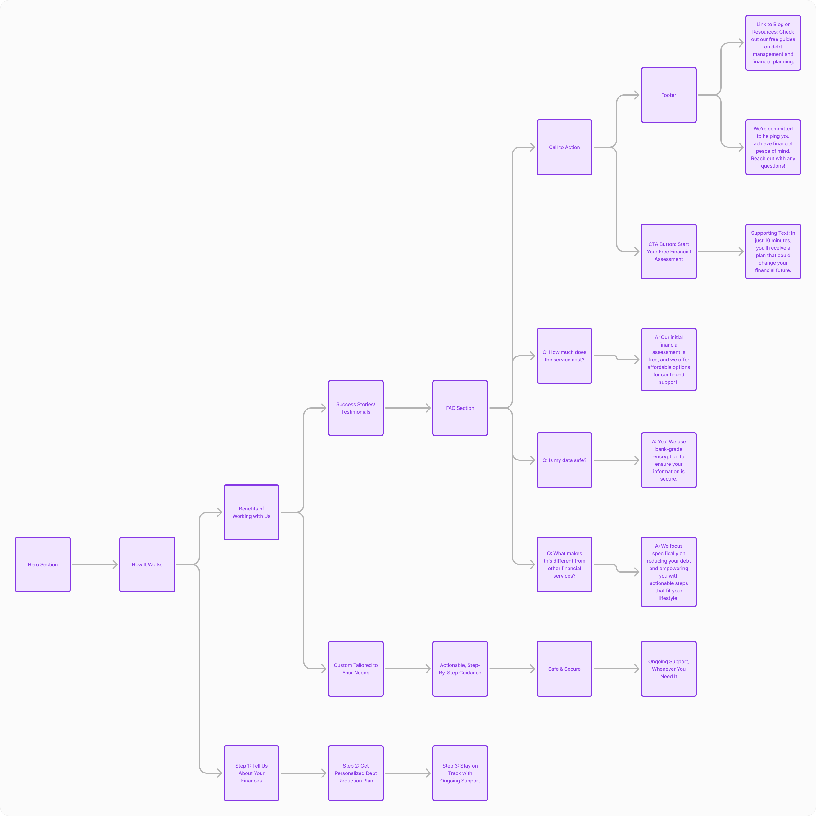
I mapped the end-to-end user journey to identify friction points across the experience
The website and onboarding were functioning as separate experiences but users perceived them as one continuous journey.
Improving the website alone wasn’t enough; onboarding needed to reinforce the same trust and clarity.
Low and Medium Fidelity Prototypes
Early prototypes focused on information hierarchy and content clarity rather than aesthetics.
Designing the Onboarding Flow
Users who signed up often felt overwhelmed and unsure how to begin their financial planning journey.
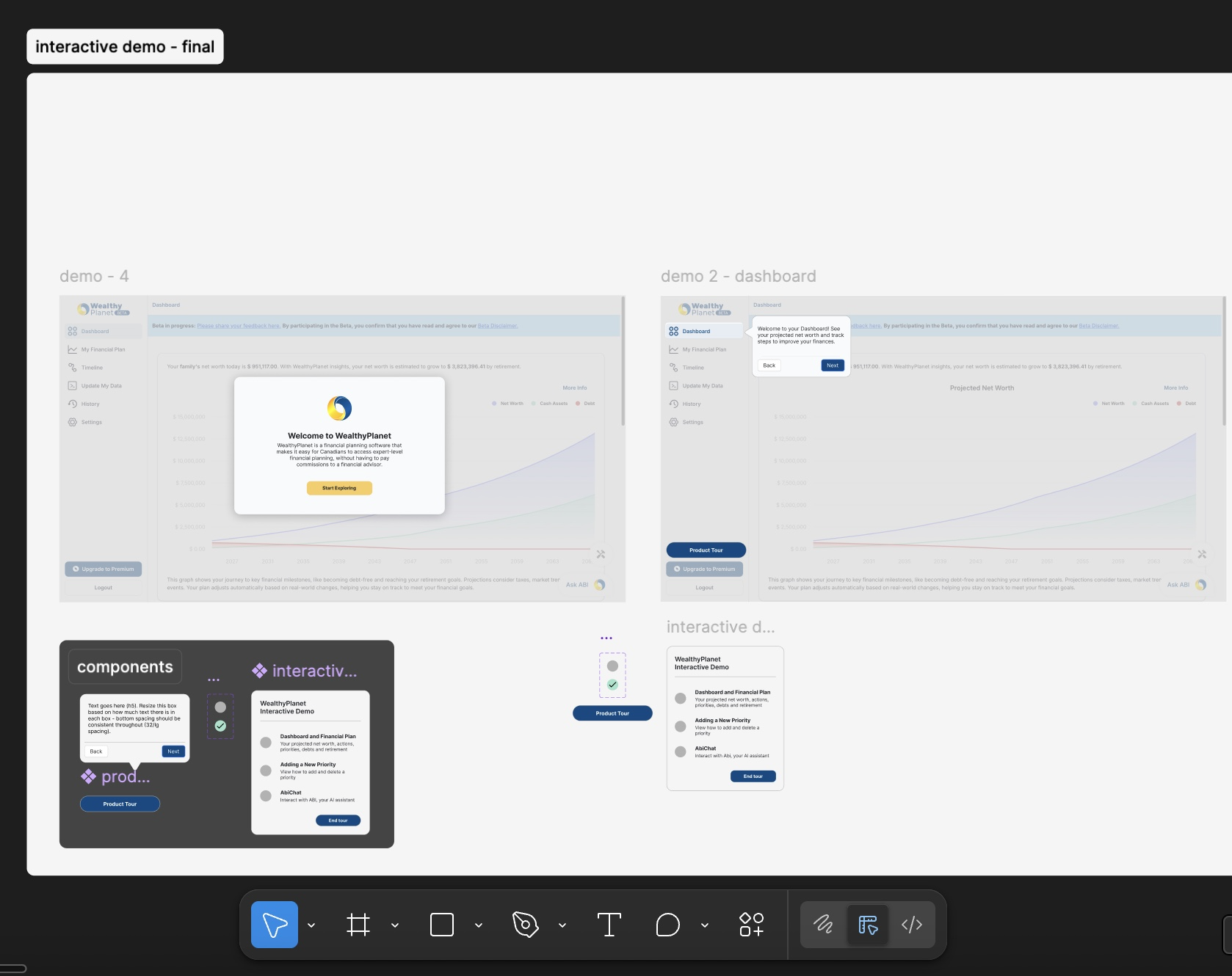
Goal
Guide users toward their first meaningful action while reducing cognitive and emotional load.
Key Design Decisions
Progressive disclosure: Introduce information in manageable steps
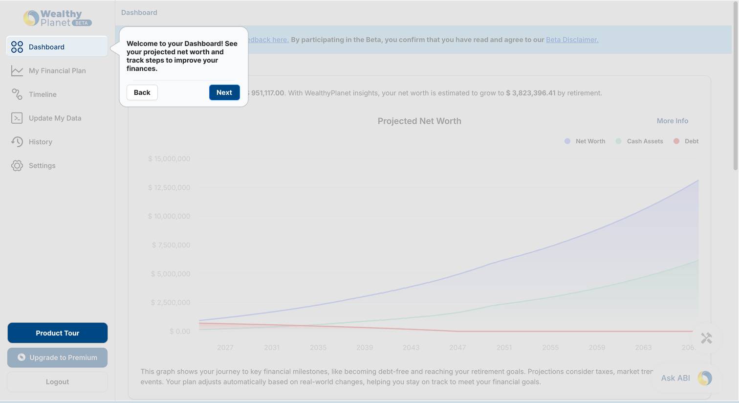
Guided explanations: Clearly explain how the product works before requesting inputs

Tradeoffs Considered
Speed vs. Confidence
I chose a slightly longer onboarding flow to ensure users understood how the product worked before taking action, prioritizing trust over raw speed.
Personalization vs. Cognitive Load
Rather than collecting detailed financial information upfront, I deferred personalization to later steps to reduce early friction.
Validation & Iteration
To validate the onboarding and website experience, I conducted usability testing on mid-fidelity prototypes with a small set of target users. The goal was to ensure the experience felt clear, trustworthy, and guided, especially for users unfamiliar with financial planning tools.
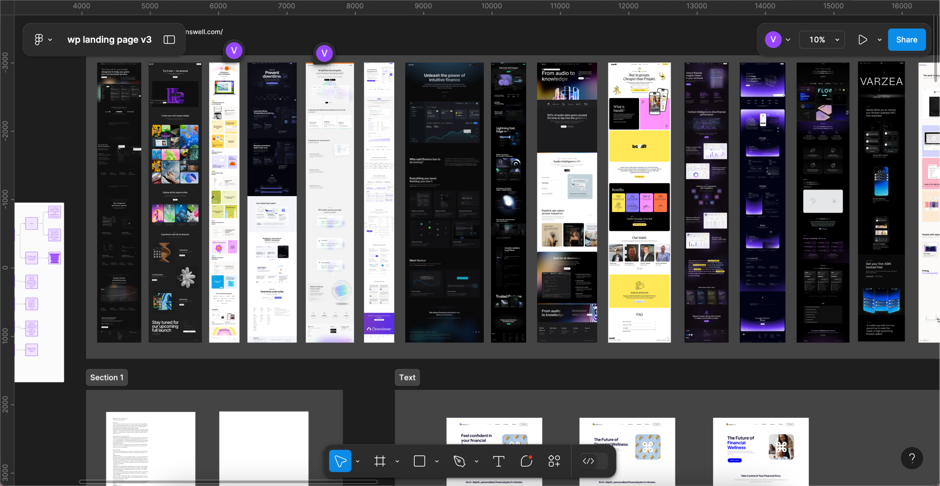
Iterations on the final design through each stage for the landing page. Take a look if curious :)
Figma Link Loading! Might take a few seconds
Key Findings → Design Iterations
Users wanted clearer expectations before starting
→ Expanded the “How It Works” explanation and set clearer expectations during onboarding
Trust cues were most effective when introduced early
→ Moved statistics and credibility signals higher in the flow
Language needed to work for both individual users and B2B2C stakeholders
→ Simplified copy and avoided internal or technical terminology
Final Design
In the final iterations, I focused on unifying the website and onboarding experience into one cohesive system.
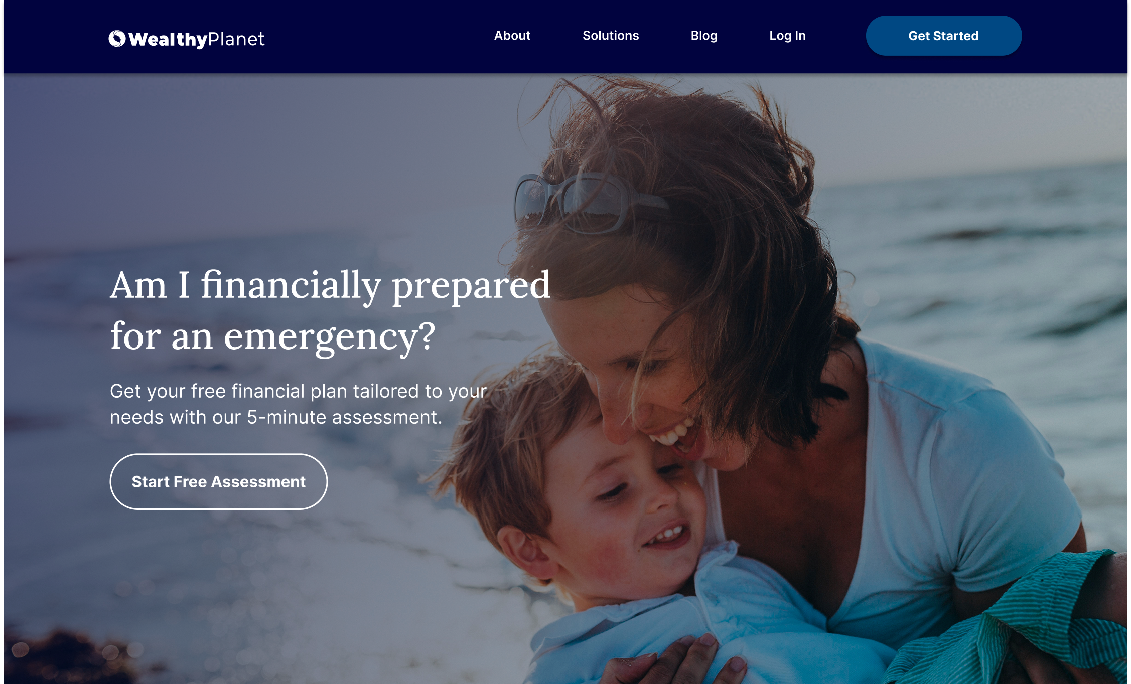
Refined the hero section to clearly communicate value within seconds
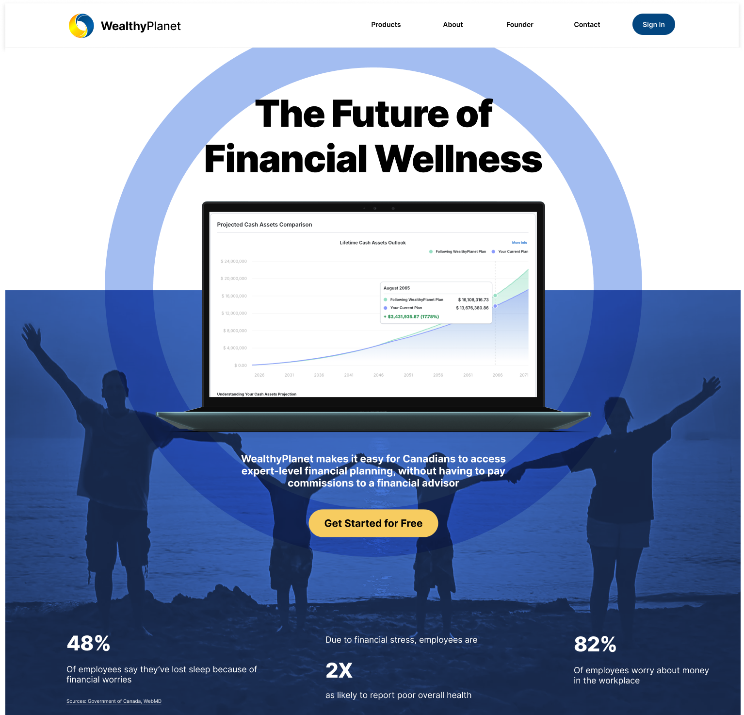
Simplified content hierarchy across key pages, following the format from the main page
Results and Takeaways
+ 62%
Increased user sign-ups in the first month post-launch.
+ 20%
Users time spent time on the website.
Positive qualitative feedback highlighting clarity, approachability, and ease of use
These outcomes confirmed that improving clarity, trust, and guided activation directly influenced conversion.
What This Project Taught Me
This project strengthened my ability to operate as a designer in ambiguity, balancing business goals, technical constraints, and user trust without relying on established systems.
Onboarding is a critical part of the product experience, not an afterthought
How to design cohesive experiences that span multiple touchpoints (website + onboarding).
Clear communication often matters more than feature depth